part 1
Draped in curvilinear shapes. Bright folds dipping, sliding under and over. Swaying over and round. Gestures. Imprints of movement. Choreographed.
part 2
I keep a book on Bridget Riley nearby my working table. Absorbing her paintings. Reading commentaries on her work, her connection to artists as diverse as Cezanne, Mantegna, and Seurat whose work she studied and copied. How do you get from a Cezanne, for example, to Arcadia I? (You can view this wall painting by Bridget Riley here: goo.gl/oFUxHT.) That was Riley’s journey. My focus was on her work.
part 3
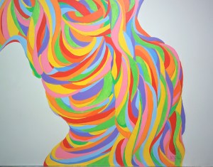
I wanted to create a work like Arcadia I – not copy it. I wanted to create a work that had that same strong, stately, confident movement of shape, line, and color. A careful look at Arcadia I yielded some basic starting points: diagonals, curved shapes, some horizontal and vertical lines, and bonded shapes created by the lines. I went for it – not seeing the resulting painting, but wanting it!
I drew straight lines and curved lines, horizontally, vertically, and diagonally. Then the erasing began and redrawing. Shaping and reshaping. Drawing and erasing over and over. Decisions made and revised or overruled. In the beginning, I would take hard glances at the copy of Arcadia I. But gradually my drawing became the focus. I was on my own. Not confident, yet deeply involved in wondering where the hell it was all leading. The complexity of the process engaged me. The not-knowingness of the work, the uncertainty did not get in the way. I was committed to the end. What if it’s…terrible…you know, really terrible! Shoulder shrug. I kept erasing and redrawing until I reached a somewhat satisfactory result.
part 4
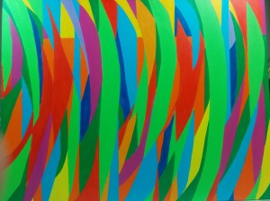
Color. No longer under the active influence of Bridget Riley, I created a color narrative prompted by nature. With so many different shapes, I had to choose a principal color. Green. That became the foundation for adding the other colors. Erasing, redrawing, and reshaping continued. The painting is a work in progress. I continue to apply more layers of paint to get the right solidity of color. As the color comes together, I find the unexpected juxtapositions and the variety of the colorful shapes interest me. I think I will title it Through the Green.

Leave a reply to ynotartblog Cancel reply